Quantcast

Jump to content


Photo

Siggy changy


  • Please log in to reply
11 replies to this topic

#1 Leo

Leo
  • 1020 posts

Posted 03 May 2005 - 01:10 PM

Well the snooker championship is over, and so my sig is out of date! Sooo, I made a new one :) *Points to sig*

I tried some new fonts too, views/comments?

#2 Dagron

Dagron
  • 1501 posts

Posted 03 May 2005 - 07:46 PM

Dame your so good at making life like sigs :p

#3 Sean

Sean
  • 6188 posts


Users Awards

Posted 03 May 2005 - 07:51 PM

I love your sigs so much. They touch me (Not in a bad way). I don't know what it is about them but they are just, sleek or something. Man I wish I could make em like you! 10/10

#4

Posted 03 May 2005 - 08:30 PM

O_o what font is that?
O_o
O_o
O_o

#5 Gargar

Gargar
  • 4901 posts

Posted 03 May 2005 - 08:57 PM

to much text lol I dont like lots of text
but good job still 8/10
the text on the name is good though

Edited by Gargar, 03 May 2005 - 08:58 PM.


#6 Fox

Fox
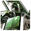
  • <img src ='http://i25.tinypic.com/4jw8jl.png'>

  • 3247 posts

Posted 03 May 2005 - 10:06 PM

O_o what font is that?
O_o
O_o
O_o

View Post


The title font is Neverwinter. And I think the pixel font is Silkscreen...

Anyway, Strife - once again, a gorgeous signature. I tend to find myself impressed by the colour schemes you use in your sigs especially. :) It looks absolutely great!

#7 Jamie

Jamie
  • 1233 posts

Posted 04 May 2005 - 12:05 AM

Yup the fonts called neverwinter iv got it

#8 Guest_Rambo_*

Guest_Rambo_*

Posted 04 May 2005 - 07:12 AM

Nice signature ^^

#9 Niche

Niche
  • 2521 posts

Posted 04 May 2005 - 08:53 AM

Aww I love that sig so much :D 9.5/10 a bit to much text

#10 Leo

Leo
  • 1020 posts

Posted 04 May 2005 - 10:29 AM

I am touched by some of your comments, thanks guys! :blush:

Yup pixel font is Silkscreen, I'm beginning to like it more than bitdust two :o

Well yeah maybe a bit too much text, but I like quotes ('pearls of wisdom' :p ) and would look pretty plain without them!

#11 Stephen

Stephen
  • 3528 posts


Users Awards

Posted 04 May 2005 - 11:12 PM

those fonts... brushes..... they're great..... I really like it, and I can't see anywhere too improve it. well done strife.  (whoops nearly typed shivi... o.O)

#12 Leo

Leo
  • 1020 posts

Posted 05 May 2005 - 07:56 AM

those fonts... brushes..... they're great..... I really like it, and I can't see anywhere too improve it. well done strife.  (whoops nearly typed shivi... o.O)

View Post

Freaky :blink: Well thanks bullet anyway  ^_^

You know, theres a slight multicolour in there ;)


2 user(s) are reading this topic

0 members, 2 guests, 0 anonymous users