
note, it's called hot sig cause when I went to automatic colour balance, it had temperature and I went to the hot part

I know the text sucks!


Musicyclopedia
Posted 19 June 2005 - 11:32 AM

Posted 19 June 2005 - 11:37 AM
Ya, it sorta doesI know the text sucks!
The sig overall isn't to bad though! A little to rough and gurngey for my likes though. For the text try this: Do a bevel and emboss on it, leave everything alone except change the depth to 0 or 1. It makes the text look a little cooler 

Posted 19 June 2005 - 11:37 AM
Musicyclopedia
Posted 19 June 2005 - 11:47 AM
thanks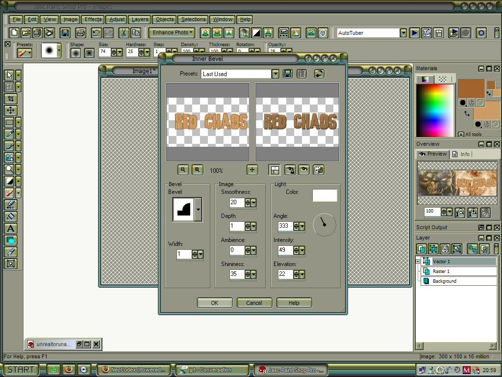
0 members, 1 guests, 0 anonymous users

Community Forum Software by IP.Board 3.4.8
Licensed to: Neocodex

