Quantcast

Jump to content


Photo

Another New One


  • Please log in to reply
10 replies to this topic

#1 �ƻ

�ƻ
  • 662 posts

Posted 03 May 2006 - 05:33 PM

Posted Image

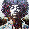
Im getting back into it. Again followed bits and pieces of a tut not a lot of it. I made the halos around the render. Umm...thats about it. C&C

#2 Justin

Justin
  • <img src ='http://i32.tinypic.com/302oyrp.jpg'>

  • 3595 posts

Posted 03 May 2006 - 07:04 PM

Nice backround, ok text... The render is kinda iffy.. Kinda low quality looking, I just plain dont like the render =\

But anyway for the halos, I dont like how their like that. I think maybe you should make them get smaller to bigger, or smaller to bigger to smaller like:

.oOo. OR .oO

>_>;

They just seem to kinda bind him, and their just there.

#3 toaofgamecube

toaofgamecube
  • 104 posts

Posted 03 May 2006 - 08:45 PM

pretty good, but sora looks.... hand-drawn, to put it mildly.
And hand-drawn pictures never go well in hi-res computer art

#4 Fox

Fox
  • <img src ='http://i25.tinypic.com/4jw8jl.png'>

  • 3247 posts

Posted 03 May 2006 - 09:45 PM

Apart from what has already been said... I think you perhaps could make the text 'Speed Dial' stand out a bit more. :)

#5 Punk

Punk
  • 1360 posts

Posted 04 May 2006 - 03:47 AM

Apart from what has already been said... I think you perhaps could make the text 'Speed Dial' stand out a bit more. :)


Untile you said that, I didnt even see the 'Speed Dial' :o

Yeah, definately make that stand out more. I like the rest though.

#6 Sakura

Sakura
  • 2180 posts

Posted 04 May 2006 - 06:13 AM

The top most halo is drawn to where it looks like it goes through his head, rather than around.

#7 Niche

Niche
  • 2521 posts

Posted 04 May 2006 - 08:16 AM

The halo is cool, it just doesnt suit the sig...urm also i would make the text stand out more. BUT! i am loving the background ^_^

#8 �ƻ

�ƻ
  • 662 posts

Posted 04 May 2006 - 12:44 PM

Ok updated it. Got rid of render and halos and also made text mroe readable.

Posted Image

#9 Charmender

Charmender
  • Awesome

  • 4104 posts


Users Awards

Posted 04 May 2006 - 01:03 PM

now theres too much balnk space try a difff render

#10 SupermanFTM

SupermanFTM
  • 5817 posts


Users Awards

Posted 04 May 2006 - 01:42 PM

Mhmm, I love the text and backround, but the render and halos...just take away from it I think. They style is nice on it's own though :p

#11 cokiwah

cokiwah
  • 1655 posts

Posted 04 May 2006 - 03:20 PM

no depth, looks like colour + brush then crosshatch filter


1 user(s) are reading this topic

0 members, 1 guests, 0 anonymous users