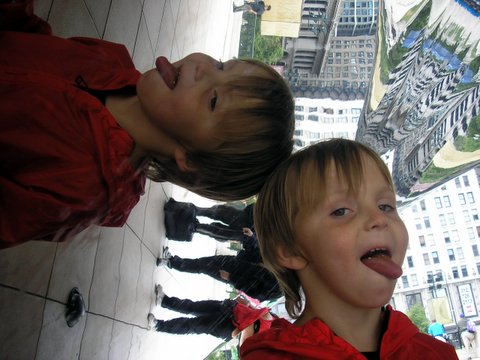
Quantcast

Jump to content


Photo

A very long time..


  • Please log in to reply
13 replies to this topic

#1 Cam

Cam
  • 1690 posts

Posted 06 December 2006 - 06:25 AM

Since ive posted a sig..

And here ya go!

This is the first i've done in months and months..
IPB Image

#2 Zakk

Zakk
  • 123 posts

Posted 06 December 2006 - 06:31 AM

I looked at this for like fifteen minutes...
And then realised there's a black guy in the background. O.o

#3 Nick

Nick
  • <img src="http://i29.tinypic.com/9iwl5w.jpg">

  • 6051 posts


Users Awards

Posted 06 December 2006 - 07:15 AM

Render needs to be more visible.

#4 sarah.

sarah.
  • 5392 posts


Users Awards

Posted 06 December 2006 - 07:19 AM

It's a little too colorful imo, and the render is actually quite hard to see.

#5 Silk

Silk
  • 6906 posts


Users Awards

Posted 06 December 2006 - 07:21 AM

Gah, it looks too messy and uncontrolled. The idea is great, but just get rid of the scanlines and some of the colour splats.

#6 Nick

Nick
  • <img src="http://i29.tinypic.com/9iwl5w.jpg">

  • 6051 posts


Users Awards

Posted 06 December 2006 - 07:22 AM

I'm looking really hard Zulfi, but I cannot see any scanlines. blink.gif

#7 Silk

Silk
  • 6906 posts


Users Awards

Posted 06 December 2006 - 07:25 AM

The 'X's on the left and the right. Poor choice of wording on my part, sorry.

#8 Nick

Nick
  • <img src="http://i29.tinypic.com/9iwl5w.jpg">

  • 6051 posts


Users Awards

Posted 06 December 2006 - 07:27 AM

Oh yeah, that patterning doesn't look good in my opinion, either.

#9 Jenna

Jenna
  • 2129 posts

Posted 06 December 2006 - 07:44 AM

hehe the head is kinda just floating out there smile.gif

#10 Bilal

Bilal
  • 1087 posts

Posted 06 December 2006 - 09:49 AM

lol...good idea but yeah the pattern doesn't look too good and make the render a bit more visible as well as taking out some of the solour splats...

#11 j0k3r210

j0k3r210
  • 1508 posts

Posted 06 December 2006 - 02:42 PM

its um interesting but the effects and colors seem a lil overdone to me

#12 Grizzly

Grizzly
  • <img src ='http://i29.tinypic.com/9iwl5w.jpg'>

  • 3964 posts


Users Awards

Posted 06 December 2006 - 05:02 PM

The effect looks good but seems a bit overdone. Try controlling where you apply it to and try to leave more of the render visible as others have suggested. Some negative space would also give you more versatility in regards to text.

#13 Cam

Cam
  • 1690 posts

Posted 07 December 2006 - 03:14 AM

it looked good late last night but now its crappy!

#14 Jeff

Jeff
  • 2342 posts

Posted 07 December 2006 - 11:56 AM

I like it. I think you should have more of a focal point. Maybe if I can get my hands on a psd of it, I could try out some lighting with it?

Anyways, I like the style.


1 user(s) are reading this topic

0 members, 1 guests, 0 anonymous users