QUOTE(Joe @ Jan 3 2007, 07:19 PM)

Well... let's see.
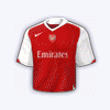
First of all, you seem to have used four different typefaces, which, for someone who isn't a total text pro, is a complete and utter nono.
Then, you've got either an over- or under-contrasted render (depending on which version we look at) on a pastel, patterned background.
To me, the beauty, the artistic value in sports lies in the motion, but you've abandoned that notion, and created something almost stagnant. Apparently with sixties wallpaper to boot.
Then, we have the white border, which in itself, is nothing bad. However, I think it's set to pin light or some other such blending mode, which only (in version one) shows part of the lower layers in an isolated area. So it looks like there's some accidental leakage of colour... it just looks sloppy, to be honest.
I see what you were trying to do with the "x"s on the right, but it fails miserably, because your background is already covered with patterns, and this addition is a stark contrast to that which isn't repeated anywhere else in the piece.
Finally, why does it look like an elephant ejaculated all over Thierry's shirt?
^Wow dude you're monstrous. Leave it to joe to know just how to shut down someones pride. Meany


 *goes cry in the corner
  *
* 
