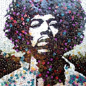
I used various stocks, some filters/default brushes aswell & lots of adjustment layers.
Comments & Criticism welcome.

Credits:
http://sxc.hu
=resurgere. Their terms of use.


Posted 22 March 2007 - 07:59 AM

Posted 22 March 2007 - 08:18 AM

Posted 22 March 2007 - 08:20 AM

<img src="http://i29.tinypic.com/9iwl5w.jpg">
Posted 22 March 2007 - 08:21 AM
Posted 22 March 2007 - 08:42 AM
Edited by hoju, 22 March 2007 - 08:44 AM.
Posted 22 March 2007 - 08:52 AM

Awesome
Posted 22 March 2007 - 08:53 AM


Posted 22 March 2007 - 08:56 AM

Posted 22 March 2007 - 09:03 AM
Awesome
Posted 22 March 2007 - 09:07 AM

Posted 22 March 2007 - 09:22 AM
I had that market cornered...
Posted 22 March 2007 - 09:25 AM
I had that market cornered... You don't post any often enough.
Posted 22 March 2007 - 09:47 AM
<img src="http://i29.tinypic.com/9iwl5w.jpg">
Posted 22 March 2007 - 11:42 AM
Posted 22 March 2007 - 11:53 AM
Posted 22 March 2007 - 12:46 PM
Awesome
Posted 22 March 2007 - 01:04 PM
Posted 22 March 2007 - 01:05 PM

Posted 22 March 2007 - 01:26 PM
0 members, 1 guests, 0 anonymous users

Community Forum Software by IP.Board 3.4.8
Licensed to: Neocodex