

Quantcast

Jump to content


Photo

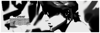
Forever and ever...


  • Please log in to reply
5 replies to this topic

#1 Tyler.

Tyler.
  • <img src='http://i29.tinypic.com/9bevfc.jpg'>

  • 2373 posts

Posted 17 August 2007 - 05:07 PM


C/C appreciated biggrin.gif White border.

#2 Big Joe

Big Joe
  • 755 posts

Posted 17 August 2007 - 05:19 PM

Too muich discoloration and render not visible...

#3 Tyler.

Tyler.
  • <img src='http://i29.tinypic.com/9bevfc.jpg'>

  • 2373 posts

Posted 17 August 2007 - 05:23 PM

Stock used, not a render tongue.gif I'll try burning it out and see if it can be fixed.

#4 Zeeky

Zeeky
  • 410 posts

Posted 20 August 2007 - 12:40 AM

Why do you suck so much color out of all of your signatures? I don't like the look at all. Everything is too fuzzy and not pleasing to the eyes, poor choice and placement of text and it doesn't flow at all. I don't understand where you're trying to go with any of these.

#5 Sida

Sida
  • Tsvetesman

  • 3865 posts

Posted 20 August 2007 - 09:56 AM

You could have done much more with this, but it's not too bad. I'd choose the second one.

#6 Kitchwa

Kitchwa
  • 3256 posts

Posted 20 August 2007 - 11:02 PM

This has potential. I like the way it looks but I'm feeling the 'unfinished' touch for this sig. See if theres anything you could think of doing to add anything to this sig (eg. Try bringing the person out a bit more) smile.gif


2 user(s) are reading this topic

0 members, 2 guests, 0 anonymous users